7 Tips on Choosing the Right Stock Images

7 Tips on Choosing the Right Stock Images
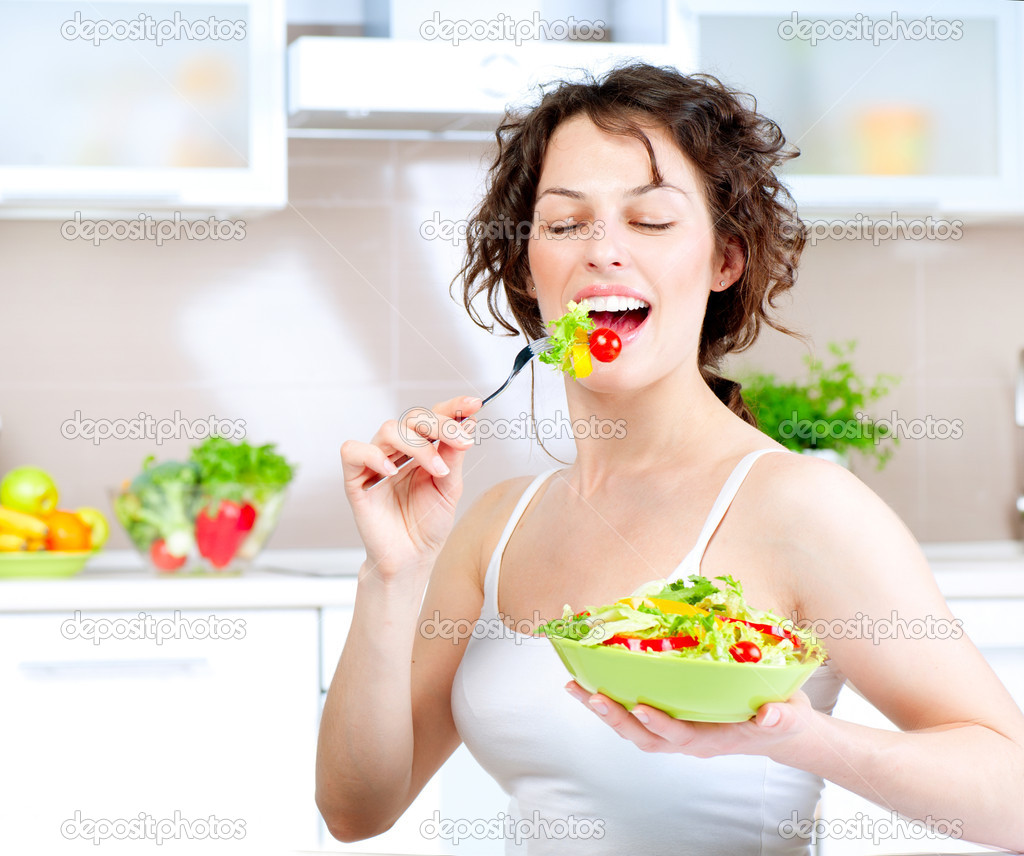 Haven't we had enough of these types of images?
As a designer, I’ve probably searched through millions of stock images over the years. I’ve seen enough “lady laughing while eating salad” and “guy smiling with thumbs up” pics to fill ten hard drives. While it may be a struggle to find the “perfect” image for your website, blog or social media post, there are ways to make the process a little less stressful. Below are my tips on finding the right stock image for your project.
1. Where to Source
First, there are many, many stock image sites out there. Some are free, some royalty free, and some are licensed. You should NEVER ever pull an image off of a Google search for commercial use. Images can be copyrighted, and your organization can get into big trouble for using an image without a license.
I tend to use royalty free sites. I find that the features of those sites – advance search capabilities, lots of images, somewhat better quality – are worth the subscription. However, there are plenty of free stock image sites you can try as well. Here are a few free and royalty free sites to get you started:
Royalty-free:
2. Know Your Specs
Before you begin your image search journey, you need to know what size the final image needs to be. The overall dimensions for where the image will be placed is the biggest determining factor for image selection.
- Is the image horizontal, vertical, square, or panoramic?
- What are the pixel dimensions (width x height) for the space?
- Do the dimensions or aspect ratio change with the size of the window or the device it’s viewed on?
- Is there an area of the image that will be overlaid with text? If so, how big is the text and where on the image will it be displayed?
If you’re sourcing an image for social media, then it’s pretty easy to find out what size it should be. Image sizes for social media posts are standardized, so you can look up the dimensions for Twitter, Facebook, LinkedIn, etc., from a number of sources. I bookmarked SproutSocial’s Always Up-to-Date Guide to Social Media Image Sizes so I can reference it whenever I need to look up the dimensions for a particular type of social image.
If you are sourcing an image for your blog or website, there are a couple of ways to determine the correct image dimensions. First, you can ask the site’s designer or developer for the specs. If you can’t do that, then find the dimensions of another image that is the same size or in the same place you plan to place your new image. To do this:
- Right-click on the image
- Choose Inspect or Inspect Element
- In the window that pops up, the image code should be highlighted. Hover over this to get a pop-up detailing its dimensions.
3. Understand the Context
Now that you know what size the image needs to be, the next step is to focus on the purpose of the image.
Brand-defining: a global, high-level image that speaks to your overall brand/messaging. Typically, you’d see a brand-defining image as a homepage hero, presentation deck cover, or tradeshow graphics.
Attention-seeking: an advertising-focused image, where the goal is to be noticed. Opt for attention-seeking images for social media posts to stand out from the crowd. Look for images that have more contrast in their color palettes, or use humor to call attention to themselves.
Trust-building: an image intended to create connection and foster trust with the customer. These types of images can be used anywhere, but are optimal for pages where you are trying to convert a visitor to a customer, such as a campaign landing page. A people-focused image could work well in this context. Studies show that pages using images with people have a higher conversion rate than pages that do not.
Content-illuminating: Most of the images I source tend to fall into this category. You need an image to accompany a blog post or to detail a concept of your service or product. Choose an image that contextually relates to the information you provide. For example, if you’re writing a blog post about internet security, an image of a lock or a shield is a good option.
4. Define the Style
What kind of feeling are you trying to evoke with this image? Edgy? Sophisticated? Fast? Trustworthy? Get an understanding of what emotions you want to convey with the image. For example, you want to express that your product or service saves people time. Which image do you think would resonate more emotionally to the viewer?


Your organizations brand style guide could also be useful. Look to what the guide defines for photography. You may need to stay within a certain color palette, avoid certain subjects or focus on specific topics. The brand style guide should have a list of Do’s and Don’ts that can help define your style.
TIP: Be careful when using negative imagery: Your first instinct for a concept may be to show the “pain point” of a situation – someone who is frustrated, tired, or scared. However, images that show negative emotions or have a negative connotation could inadvertently cause the viewer to associate negative feelings with your company. Instead, focus on the positive outcome that your product or service provides.
5. Search with the Right Terms
There are hundreds of thousands – if not millions – of images on a stock site, so searching with the right words is key. Remember that there can be many connotations for keywords, so you may need to get creative with terms. For example, when I search on “cloud migration” I get a bunch of images like this:

Knowing what style of image you’re looking for helps. You can filter for people, demographics, or colors on most sites. When choosing keywords, try using verbs related to the context, or hit up a thesaurus for variation. If you need something less specific or more of a background image add “abstract” to the keyword list.
6. Keep it Real
There is a lot of cheesy stock imagery out there. They’re the types of images that get turned into meme’s because they are so obviously staged.

Poor Harold, you can see the pain in his eyes.
Once you know what to look out for, though, it’s pretty easy to avoid these “too stocky” stock images. The most important thing to note is whether or not the situation feels real. Do your employees all stand around in the office and stare in one direction? Do pictures and text shoot out of their laptops into the air in real life? Do people stare at you smiling while wearing headsets? Is everyone high-fiving all the time?
Try to find images that feel real and natural. Below are a few Do’s and Don’ts:
 DON'T use unrealistic, over-the-top scenarios to convey emotion.
DO opt for a realistic expresstion in a conveivable scenario to convey emotion.
 DON'T show a "team" photo that looks like a bunch of adults pretending to take a class picture.
DO choose a more candid shot with interesting framing.
 DON'T use photos of people high-fiving. How often does that happen in the workplace?
DO show colleagues engaged in what their doing and looking competent.
 DON'T choose photos with poor lighting, contrast, coloring or framing.
DO select images that offer an interesting composition, good lighting and contrast.
 DON'T select images with word overlays or fake type to explain a concept.
DO find images that convey the topic in an emotionally resonant way.
7. Be inclusive
As you wander through stock image sites, one thing becomes abundantly clear: there are a whole lot of white people in stock images. There’s nothing wrong with that, but it’s easy to miss the mark on inclusivity when there are so many more whites-only images to choose from. Pay attention to the subjects in your imagery and ask yourself these questions:
- Are the ages, races, and genders of the subjects in your images representative of your organization?
- Is there diversity across the images used on your website?
- When you do see non-white or non-male presenting subjects in an image, are they shown in a stereotypical or discriminatory way?
On many stock image sites, you have the ability to filter for different ethnicities, ages and genders. However, one thing you want to avoid is a forced display of diversity. One image of a row of different-looking people staring back at you may not convey the message. Better to opt for diversity across all images on the site to have the intended effect.
Conclusion
Finding the right image for your post, website or other project can be challenging. Have a plan when you begin your search and take your time. Focus on the emotions and context you want to convey and seek out interesting, natural-looking images that align with your concept. You'll be happy with the final result!